|
|
Used to chart (graph) data over a time period. |
 |
Time series graphs may be created for up to 8 data sets (variables) - up to six variables on one Y-axis and two on a separate Y-axis, the Overlay axis.
Time Series graphs are "Hot". This means that the user can click on a data point to display the actual data value for that point. As the amount of data increases on the graph, the target area for each point gets smaller and at a certain point that target area is too small to find with the mouse and the "Hot" feature appears to be disabled. Simply narrowing the date range or reducing the number of variables displayed can overcome this.
To create a basic Time Series graph:
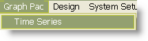
- Select Time Series from the Graph Pac menu.
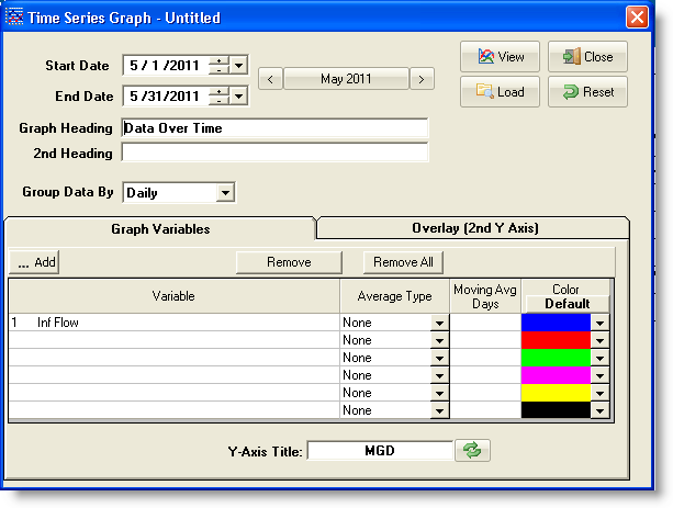
- Enter the Start Date and End Date for the date range to be used.
- Enter the Graph Title to appear at the top of the graph.
- Select the variable(s) to graph.
- Click The [View] button to display the graph.
BUTTONS:
 |
Used to set a date range |
 |
Loads a graph that has been previously saved. The Load Graph dialog will be displayed. Use the list box to select the graph to load, change the dates if desired, and click [OK]. The graph will be displayed on the screen. Select [Cancel] to return to the Time Series Data Selection form. |
 |
Outputs the graph to the screen. |
 |
Clears the current graph and display settings allowing a new graph to be setup from scratch.
|
 |
Exits to the menu. |
 |
opens a variable browser which can be used to add variable(s) to the graph |
 |
removes the selected variable from the graph |
 |
removes all variables from the graph |
 |
Resets the Title (Y-Axis or Overlay) to the units of the currently selected variables. The titles default to the units unless the title was edited by the user. Click this button after editing the title to let WIMS set for you. |
FIELDS:
Start Date: Beginning date of the date range to analyze.
End Date: Ending date of the date range to analyze.
Graph Heading: The main heading for the graph, appears at the top of the graph.
2nd Heading: The subheading for the graph. Appears just below the Graph Heading. Works best with 2D graph types.
Group Data By: The frequency of data shown on the graph. Data can be displayed/grouped every 15 Minutes, Hourly, Daily (default), Weekly, or Monthly. For example, if 15 Min is chosen, 15 minutes variables (i.e. track every set to 15 minutes in variable setup) will have each raw value plotted, minutely variables will be averaged (default) for each 15 minute period and plotted, and hourly values will be plotted once an hour (i.e. every 4 points).
Variables: Select variables to graph using the primary Y-Axis.
Summary Stat: Each variable depending on the Group Data By setting will have different Summary Stat options.
| Summary Stat |
Description |
|
| None |
Displays all values |
|
| Weekly |
Averages values for 7 consecutive days and plots the average value on the last day of each 7 day period |
|
| Monthly |
Averages values for each calendar month in the specified date range and plots the values on the last day of each month. |
|
| Daily Average |
Graphs the daily average of a daily detail type variable when Group Data By set to Daily. |
|
| Daily Max |
Graphs the daily Maximum of a daily detail type variable. |
|
| Daily Min |
Graphs the daily Minimum of a daily detail type variable. |
|
| Daily Sum |
Graphs the daily total/sum of a daily detail variable. |
|
| DDAVG(x,y) |
Graphs the average of a daily detail variable for the hours specfied by x and y. x is the start hour, y is the end hour. |
|
| DDMAX(x,y) |
Graphs the maximum of a daily detail variable for the hours specfied by x and y. x is the start hour, y is the end hour. |
|
| DDMIN(x,y) |
Graphs the minimum of a daily detail variable for the hours specfied by x and y. x is the start hour, y is the end hour. |
|
| Hourly Average |
Graphs the average for the hour of a 15 Minute, 5 Minute, or minutely variable. |
|
| Hourly Max |
Graphs the maximum value for the hour of a 15 Minute, 5 Minute, or minutely variable. |
|
| Hourly Min |
Graphs the minimum value for the hour of a 15 Minute, 5 Minute, or minutely variable. |
|
| Hourly Sum |
Graphs the total for the hour of a 15 Minute, 5 Minute, or minutely variable. |
|
Y-Axis Title: Text used to label the Primary Y-Axis. Defaults to the units type of the variable selected in the First Var field. May be edited after the First Var has been selected.
Overlay-Axis Title: Text used to label the secondary Y-Axis. Defaults to the Units type of the variable selected in the Overlay Var field. May be edited after the Overlay Var has been selected.
Overlay Var: Select the variables to graph using the secondary (right side) Y-Axis.
Note: See How To Change Properties for a Second Overlay Parameter (KB article Q14343)
|