|
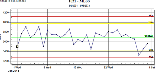
A trend graph is a control chart showing data over time with control limits.
|
 |
To produce a Trend Graph:
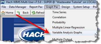
1. Go to Graph Pac, Variable Analysis Graphs.
2. Fill out the form as follows:
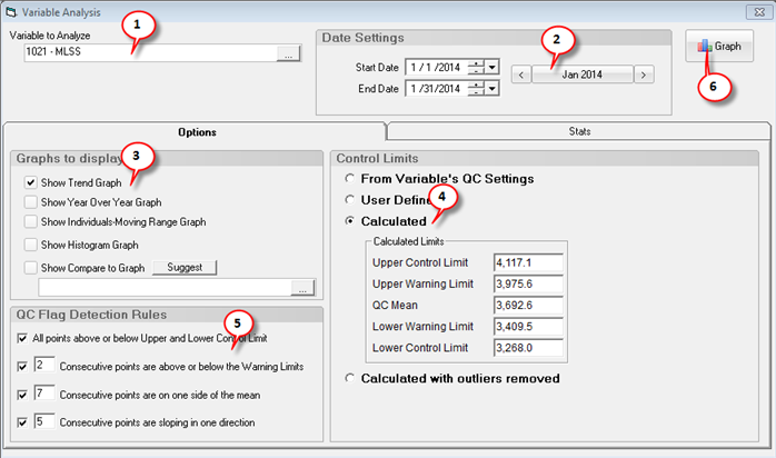
1. Use the Variable Picker to set the Variable to Analyze.
2. Set the date range for the graphs and analysis. Stats will automatically be calculated and displayed on the Stats tab. Calculated and Calculated with outliers removed Control Limits will be refreshed.
3. Check the Show Trend Graph option.
4. Choose which Control Limits to use. See Calculating Control limits.
- From Variable's QC Settings. The Quality Control Limits set on the Quality Control Tab in Edit/View Variables will be read in.
- User Defined. Enter your own UCL, UWL, QC Mean, LWL, and LCL.
- Calculated. The control limits are calculated based on the variable and date range selected.
- Calculated with outliers removed. The control limits are calculated based on the variable, date range selected. However, outliers are removed from the data set based on the Outlier Detection Selection on the Stats tab. See Outlier Detection for details on detection methods.
5. Set your QC Flag Detection Rules. These settings are used to analyze the graphs and flag QC or SPC "Special Causes".
3. Click 
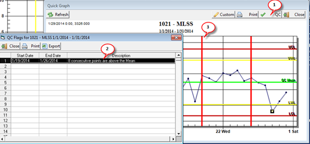
4. To determine QC Flags for the Trend Graph, click  :
: