|
A Histogram shows the frequency of certain values or categories in a bar chart. |
 |
It can be used to answer questions like:
What range do most of my results fall into?
Is the data central around a set point or average?
To produce a Histogram Graph
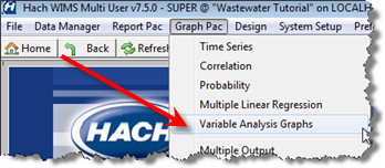
1. Go to Graph Pac, Variable Analysis Graphs.
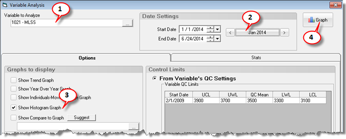
2. Choose your variable and date range. In this example, choose MLSS and Jan 2014.
3. Check the Show Histogram Graph. Click  :
:
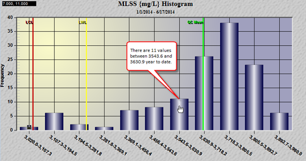
This histogram shows that most of our data is between 3600 and 3893, however when we go below those values it seems to drop of steeply. Hopefully, this can start a discussion around why and lead to better understanding of the process.